Decide whether your office chair should blend, bridge existing finishes, or stand out—and preview the complete chair in your real room before buying.
The right ergonomic setup should adapt to your body, support frequent movement, and stay comfortable through a full workday.
Choose an office chair color only after the chair passes your fit and function checks. Then decide what visual job the chair should perform: blend into the room, connect two existing finishes, or act as an accent. Black is a flexible default, gray softens the contrast between dark equipment and a light room, white can feel lighter beside pale furniture, and a saturated color works best when it deliberately repeats a color already in the space.
There is no universally best office chair color. The useful question is whether the complete chair—frame, mesh or upholstery, base, armrests, and casters—works with your desk, floor, light, maintenance habits, and camera background. This guide gives you a practical way to make that decision without relying on vague color psychology.
Color is the last filter, not the first
A chair that looks right but does not fit your body or workstation is still the wrong chair. Before comparing colors, eliminate any model that cannot provide the seat height, seat depth, armrest clearance, back support, movement, or weight rating you need. The OSHA computer-workstation purchasing guide likewise puts adjustability, fit, support, materials, base, and casters at the center of chair selection rather than appearance.
If you need help with that first pass, use OdinLake’s ergonomic chair selection guide. Once two or more models meet the same functional requirements, color becomes a sensible tie-breaker instead of a distraction.
Decide whether the chair should blend, bridge, or stand out

Look at the chair from the doorway, not only from the desk. A high-back chair occupies a large vertical area and may remain visible when the desk hides most of its seat and base. Choose its role before choosing its hue.
Blend: reduce the chair’s visual contrast
Choose a color close to the largest nearby surfaces if you want the chair to recede. A black chair can blend with black monitors, a dark desk frame, or dark storage. A light chair can blend with pale walls and a white desk. Blending does not make the chair disappear; it reduces the number of strong color breaks in the room.
This is often useful when the workspace shares a bedroom, living room, or dining area. The chair remains functional furniture, but it does not become the first object the eye notices from across the room.
Bridge: connect light and dark elements
Choose a middle neutral when the room contains both dark technology and light furniture. Gray can connect a black monitor and base with a pale desk or wall without matching either one exactly. Pay attention to undertone: a blue-gray may look abrupt beside warm oak, while a warmer gray may sit more naturally with beige carpet or brown wood.
A two-tone chair can perform the same job. For example, a light frame with a dark seat may relate to a white desk and black equipment at the same time. Judge the visible proportions, not the color name in the option menu.
Stand out: use the chair as an intentional accent
A blue, green, red, or other saturated chair works best when the color has a reason to be there. Repeat it in one or two smaller elements—artwork, a desk mat, shelving detail, or accessory—so the chair feels connected rather than accidental. The repeats do not need to be exact matches; they only need to belong to the same broad color family.
Keep the rest of the large furniture relatively quiet if the chair is the accent. Several unrelated strong colors can compete for attention, especially in a compact room.
Read the whole chair, not the swatch
A product option labeled “white,” “gray,” or “blue” may describe only one part of the chair. Check every visible component:
- Frame and back shell: these often create the strongest outline, especially on a high-back model.
- Mesh or upholstery: open mesh can pick up some of the wall or room color behind it, while dense fabric or leather reads as a more solid block.
- Seat: the seat may be a different shade or material from the backrest.
- Armrests and controls: dark pads and controls can make a light chair look more two-tone than expected.
- Base and casters: these sit against the floor, so their contrast may matter more than their match with the desk.
- Metal accents: chrome, polished aluminum, or painted metal may reflect nearby light and colors.
Also compare real photographs rather than relying on a small digital swatch. Screen brightness, white balance, room lighting, and mesh transparency can all change how the same option appears. If customer or workspace photos are available for the exact model and color, use them to understand context, not to infer hidden specifications.
Use a room-and-use matrix instead of a color rule
The table below treats color as a set of visible trade-offs. It does not rank one color as cleaner, more professional, or more productive for everyone.
| Color direction | Often works when | Check before choosing | Practical tie-breaker |
|---|---|---|---|
| Black or very dark neutral | Your monitors, desk frame, speakers, or storage are already dark | Light lint, dust, or pet hair may be more visible; the chair may create strong contrast against a pale wall | Use it when you want the chair to join the technology rather than the room’s lighter surfaces |
| Medium gray | You need a bridge between black equipment and a light or mixed room | Warm versus cool undertone, plus contrast with the floor | Compare the gray beside the desk top and floor in the same photo |
| White or light neutral | The room has pale walls, light furniture, or a low-contrast visual plan | Dark transfer, scuffs, and contrast with a dark floor or seat material | Choose it when the visible frame and back look coherent in both daylight and evening light |
| Brown, tan, or warm neutral | The room contains warm wood, leather, beige, or earth-toned finishes | Whether the shade competes with rather than complements the wood tone | Place the sample beside the desk, not on a white product-page background |
| Blue, green, or another accent | You want the chair to be a focal point and the color already appears elsewhere in the room | How it looks in your camera background and whether other large accents compete with it | Repeat the color once or twice in smaller objects and keep the other large furniture quieter |
Visibility of dust or marks is a contrast issue rather than an absolute cleanliness ranking. A dark surface may reveal pale lint; a light surface may reveal dark transfer or scuffs. The material, texture, lighting direction, and your household matter as much as the color label.
Preview the chair in the room before you buy
You do not need interior-design software. A phone photo and a basic image editor are enough to expose most color conflicts.
- Photograph the desk from the normal entrance or seating-area view. Take one image in daytime and one with the lights you use at night.
- Identify the three largest color areas. Usually these are the wall, floor, desk, curtains, shelving, or a large rug. Ignore small accessories for now.
- Place a product image of each finalist over the chair area. The rough outline and color mass matter more than a perfect cutout.
- Check the chair at thumbnail size. If one version dominates the whole image when you wanted it to blend, the contrast is probably too strong. If an intended accent disappears, the contrast may be too weak.
- Open the same preview on your phone and computer. A large monitor can make subtle differences look more important than they will from across the room.
- Test the video-call view. Sit where you normally work and check how much of the backrest and headrest appears behind you. A color that works in the room may create an unwanted outline on camera.
- Choose the better compromise under both light conditions. Do not select from a single bright product photograph.
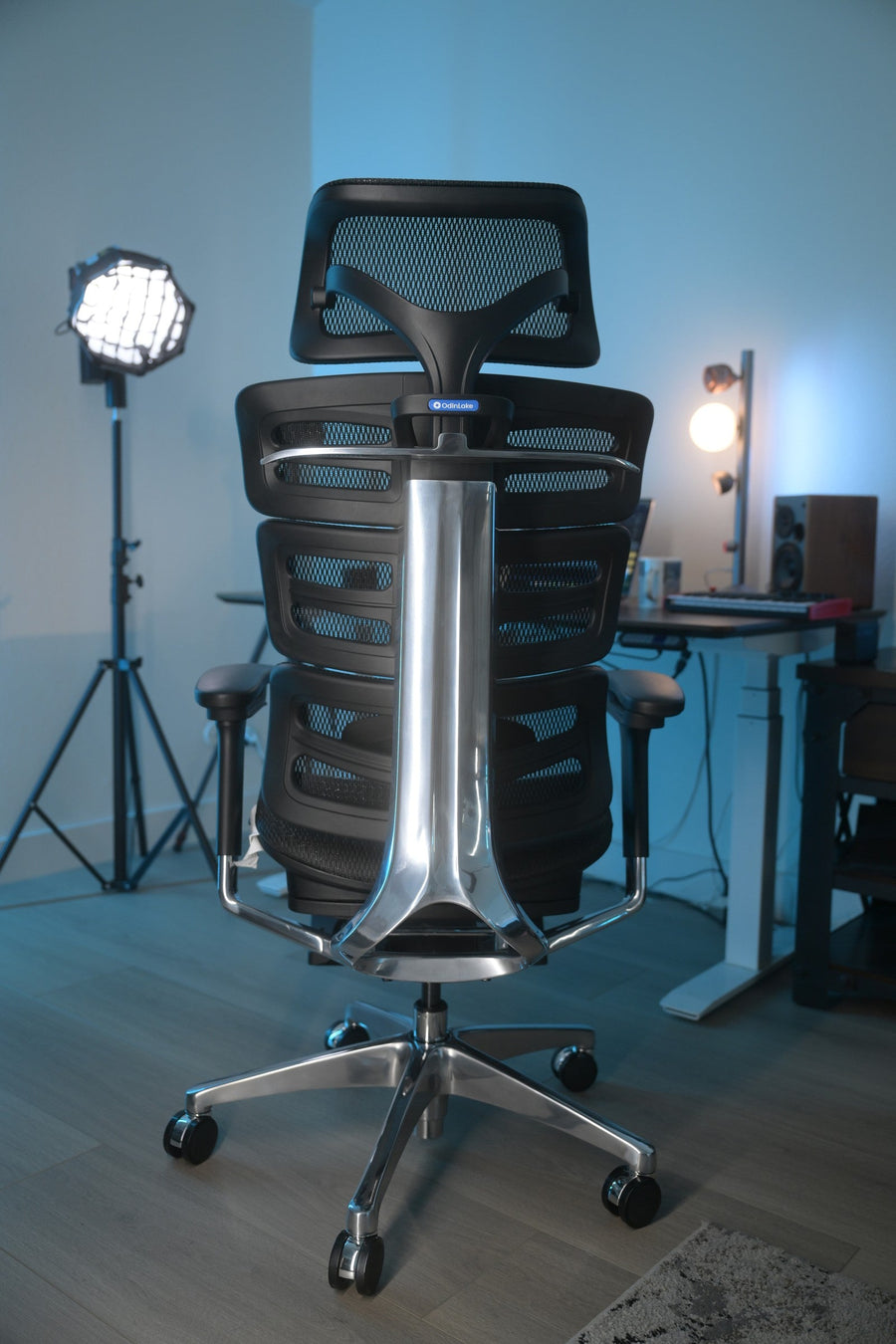
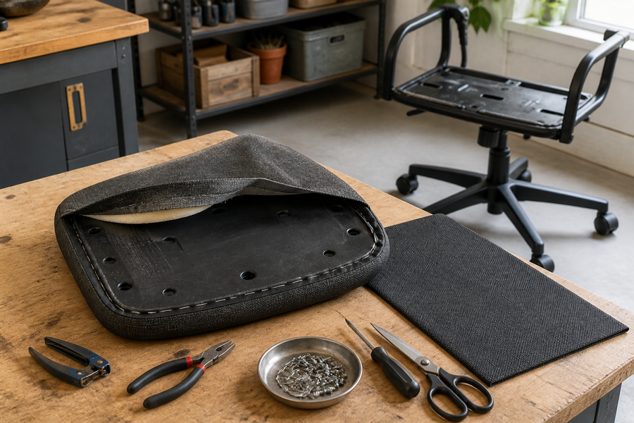
The two selected OdinLake workspace images for this article illustrate why context matters. A dark mesh chair reads as part of the equipment in a warm room with black tools and wood slats, while another dark chair becomes a strong outline in a pale, colorful setup. The chair color did not change; the surrounding contrast did.
Current OdinLake options show three different color strategies
Color options are model-specific and can change, so verify the exact option on the product page before ordering. On August 27, 2026, the current US product pages provided clear examples of three approaches:
- The OdinLake L1 product page listed Black and Gray, giving a dark default and a softer middle neutral within the same model.
- The OdinLake O1 product page listed White and Black, a higher-contrast choice between light and dark frames.
- The L1 Pro Full Aqua Blue page showed how a chair can become the deliberate color feature rather than a neutral background object.
These examples do not make one strategy better. They show why the model decision comes first: two colors are comparable only when the chair’s size, adjustments, support, material, and workstation compatibility also suit the same user. Use the current OdinLake ergonomic chair collection to compare the available models, then return to color after you have a functional shortlist.
Make the final call when two colors are close
If both colors pass the room preview, use the factor you will notice in ordinary use:
- Choose the option that creates less distracting contrast behind you on video calls.
- Choose the option that relates to the permanent surfaces—floor, desk, wall, or built-in shelving—rather than a temporary accessory.
- Choose the option whose visible lint, hair, dust, or scuff pattern you are more willing to maintain.
- Choose the more neutral option if you expect to change the room’s accent colors soon.
- Choose the accent option if the chair is meant to anchor the room and you have deliberately repeated that color elsewhere.
Then verify the final model, color name, material, and current product images on the live page. A color name alone is not enough to predict the complete chair.
Frequently Asked Questions
Is a black or white office chair better?
Neither is universally better. Black often connects easily with dark technology and desk frames, while white may create lower contrast beside pale walls or furniture. Compare the complete chair in your room and put fit, adjustability, and material ahead of color.
Should an office chair match the desk?
It does not need to match exactly. A chair can repeat the desk frame, bridge the desk top and floor with a middle neutral, or provide a deliberate accent. Exact matching can look forced when the two materials have different undertones or textures.
What office chair color is easiest to keep looking clean?
No color hides every kind of debris. Dark colors may show pale lint, dust, or pet hair, while light colors may show dark transfer and scuffs. Look at the actual material and texture, then choose the contrast pattern that fits your household and cleaning habits.
Does a white office chair make a small office look bigger?
A light chair can reduce contrast against pale walls and furniture, which may make it feel less visually dominant. It cannot change the room’s physical size, and it may still stand out strongly against a dark floor or desk. Preview the full chair in a room photo before deciding.
Is gray or black better for a home office chair?
Gray is useful when you want a middle value between black equipment and a light room. Black is useful when you want the chair to join the monitors, desk frame, or other dark components. Compare warm and cool gray undertones rather than treating every gray as the same.
Can an office chair be the accent color in a room?
Yes. A colored chair works best as an accent when the hue is intentional and appears in one or two smaller elements elsewhere. Keep the other large furniture relatively restrained so the chair remains a clear focal point instead of one of several competing accents.