Color plays a crucial role in shaping the overall ambiance and experience within an office environment. It's not merely an aesthetic choice; the colors used in office design can profoundly impact employee mood, productivity, and even brand perception. Carefully curated color schemes have the power to energize, calm, or inspire, making them a vital consideration in creating an optimal workspace.
Understanding Color Theory Basics
Color theory is a fundamental principle in interior design that helps designers create harmonious and visually appealing spaces. It involves understanding the relationships between colors and how they interact with each other. One key aspect of color theory is the distinction between warm and cool tones.
Warm tones, such as reds, oranges, and yellows, evoke feelings of energy, passion, and warmth. Cool tones, like blues, greens, and purples, create a sense of calmness, serenity, and professionalism. Complementary colors, which are opposite each other on the color wheel (e.g., red and green, blue and orange), can create a vibrant and dynamic contrast when used together. Source
The psychology of colors also plays a crucial role in interior design. Different colors can influence our emotions and behaviors in various ways. For instance, blue is often associated with trust and stability, making it a popular choice for corporate environments. Red, on the other hand, can stimulate energy and appetite, making it a common choice for restaurants. Source
Choosing Office Color Tones Based on Goals
The color tones you choose for your office should align with the specific goals and needs of your workspace. Different hues can evoke various emotions and behaviors, impacting productivity, focus, and overall mood. Here are some recommended color tones based on common office goals:
For boosting energy and motivation: Consider warm tones like reds and oranges. These vibrant hues can stimulate activity and urgency, making them suitable for collaborative spaces or areas where high energy is desired.
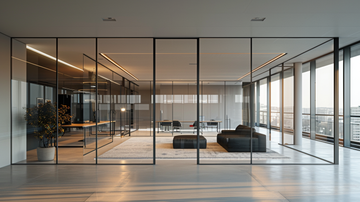
For promoting calm and relaxation: Cool tones like blues and greens are often recommended. Blue, in particular, is known for its soothing properties and can help reduce stress and anxiety, making it ideal for quiet spaces or areas where focus is key.
For fostering creativity and inspiration: Consider incorporating yellows and purples. Yellow can evoke feelings of optimism and warmth, while purple is often associated with imagination and creativity, making these tones suitable for brainstorming rooms or creative workspaces.
Applying Color Tones Throughout the Office
When applying color tones throughout the office space, it's crucial to strike a balance and create a unified aesthetic. The walls are often the largest surface area, so selecting the right wall color can set the tone for the entire space. Consider using a neutral base color, such as a warm beige or cool gray, and incorporate accent colors through furniture, artwork, and accessories.
For furniture and accents, draw inspiration from the wall color and incorporate complementary or analogous tones from the color wheel. This creates a cohesive flow and prevents the space from feeling disjointed. Accent pieces, such as rugs, throw pillows, or artwork, can introduce pops of color and add visual interest without overwhelming the space. When selecting accent colors, consider the mood and energy you want to evoke; warm tones like reds and oranges can energize, while cool tones like blues and greens can promote calmness and productivity. Source
Ultimately, the key to a cohesive and inviting office space is finding the right balance between different color tones and ensuring a harmonious flow throughout the various elements. Experiment with different combinations and don't be afraid to tweak and adjust until you achieve the desired atmosphere.
Testing and Tweaking Your Color Choices
Before fully committing to a color scheme for your office, it's crucial to test out your choices. Start by purchasing sample pots or cards of your desired hues from a paint supplier. Apply these samples to a small area of the intended space and observe how the colors look under different lighting conditions throughout the day.
Another effective strategy is to paint larger test swatches directly onto the walls you plan to paint. This will give you a better sense of how the colors will look on a grander scale. As you test out options, seek feedback from employees who will be working in the space. Their input can provide invaluable perspectives you may have overlooked.
If your initial color selections don't quite achieve the desired effect, don't be afraid to make adjustments. The testing phase allows you to tweak shades, tones, and combinations until you find the perfect palette for your office environment.